
BODY IN ZEN.
LIFE IN BALANCE.
UGO BALANC
Creative Concept
Campaign Identity
Art Direction
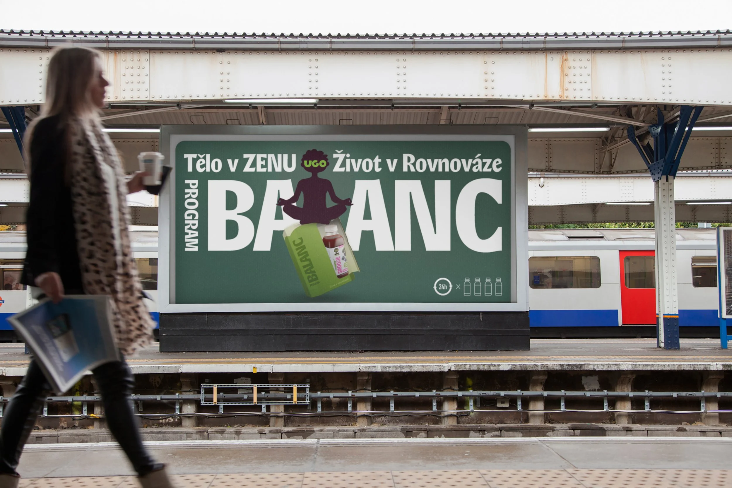
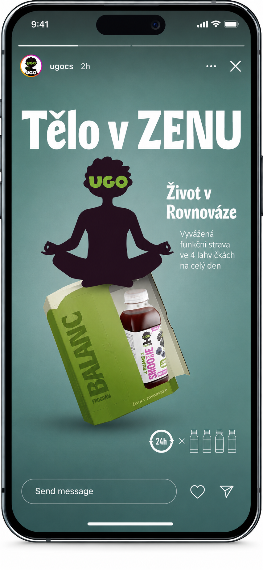
THE IDEAThe campaign was built around one central thought:What if balance had its own symbol?
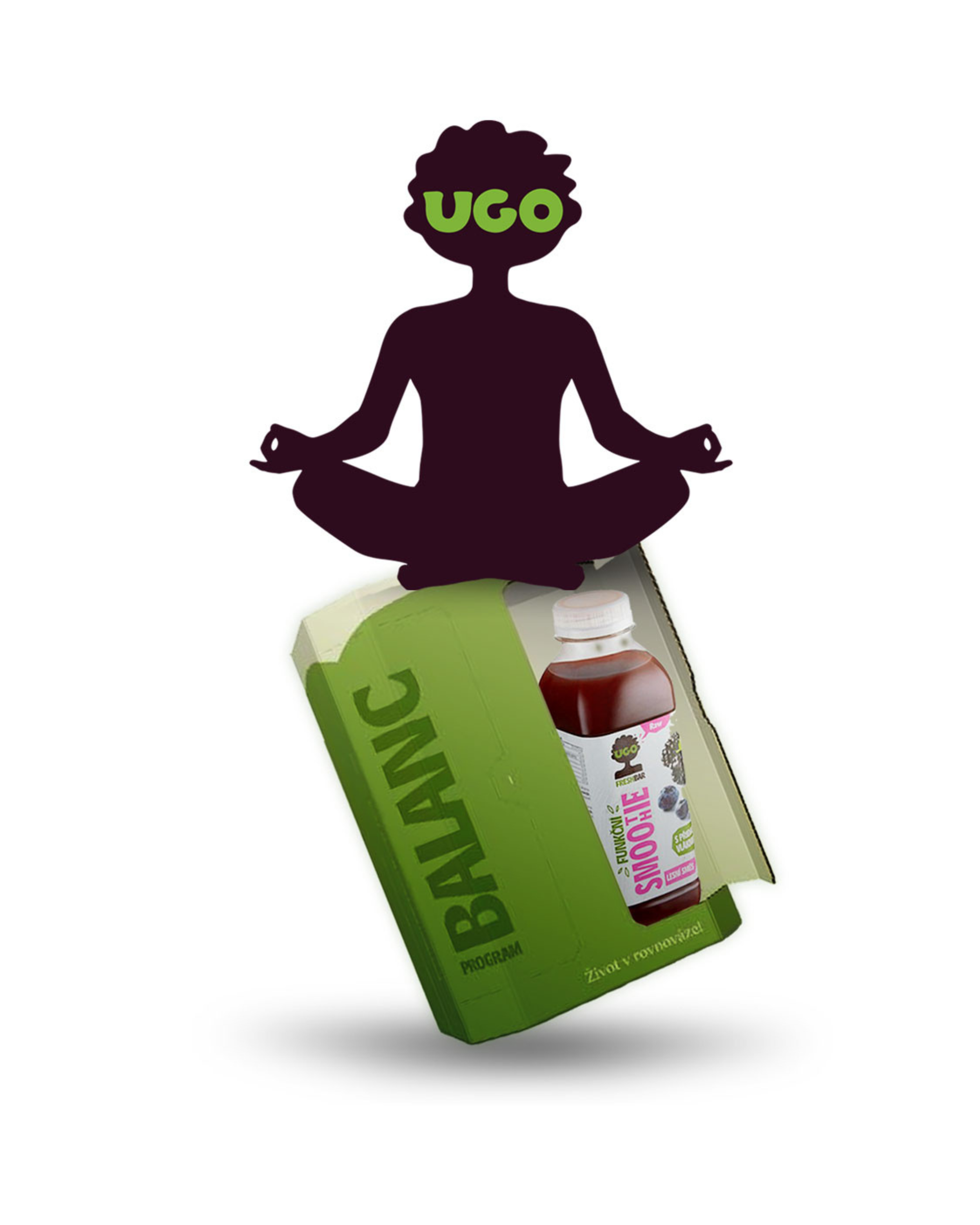
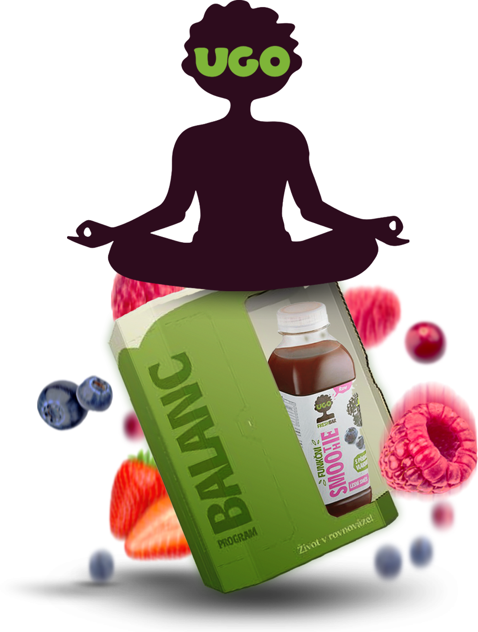
Inspired by the original UGO logo, we reimagined it into a modern Buddha icon - a visual representation of calm, mindfulness and everyday wellbeing.
THE CONCEPT
This symbol became the foundation of the entire campaign, connecting products, communication and storytelling into one cohesive concept.
THE BUDDHA SYMBOL

original logo
UGO BUDDHA
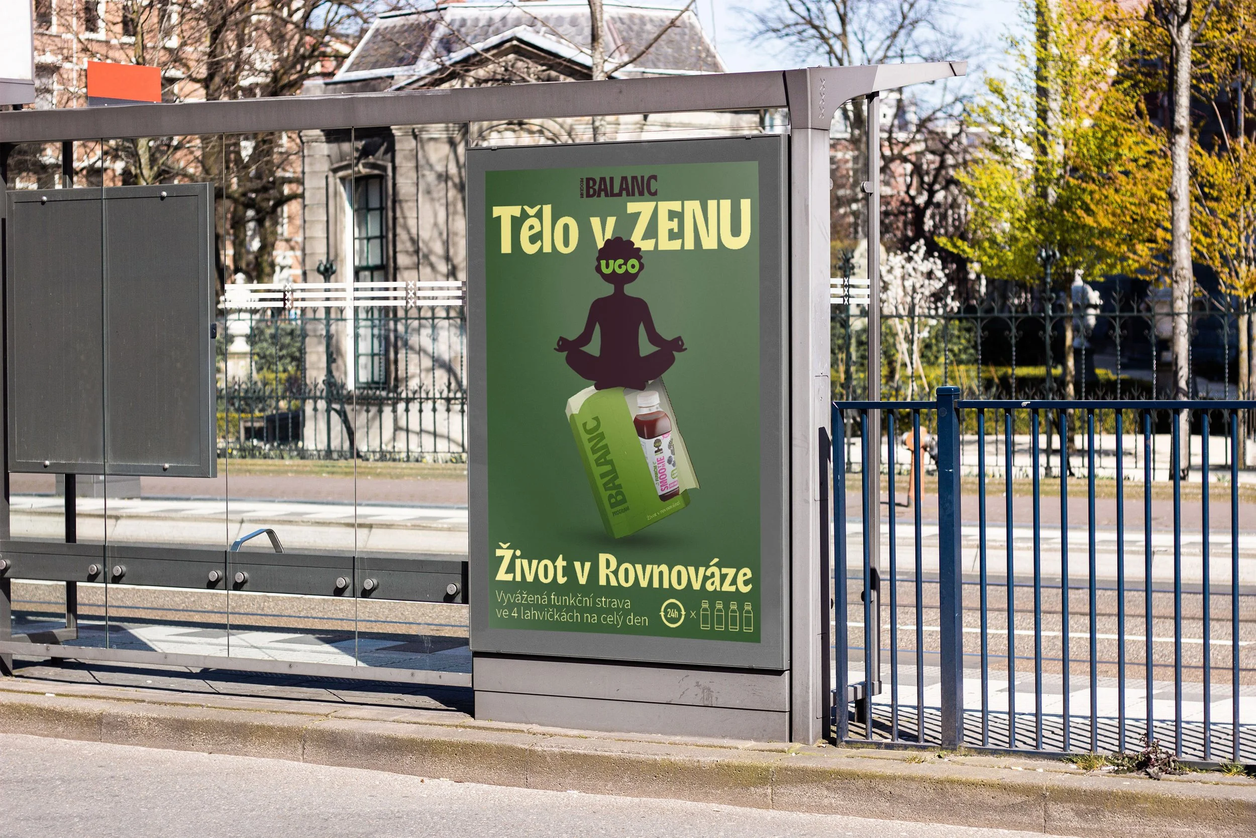
A simple idea that transformed a functional product line into a recognizable lifestyle experience.
TĚLO V ZENU. ŽIVOT V ROVNOVÁZE.
〰️
TĚLO V ZENU. ŽIVOT V ROVNOVÁZE. 〰️
THE CLAIM
“BODY IN ZEN.
LIFE IN BALANCE.”
A simple line that captured the entire philosophy behind UGO Balanc.
Not focused on ingredients or functionality, but on the feeling people are looking for — more calm, more balance and a better rhythm in everyday life.
Combined with the Buddha symbol, the claim became the foundation of the campaign's visual and verbal identity.
SOCIAL-first STORyTELLING
A simple creative idea that became the foundation of the entire campaign - from social media content and digital assets to outdoor advertising.
WHAT WE BUILT